David Opie :: Illustrations For The Dead
From 1990 to 1996, Hartford, CT-based illustrator David Opie created some of the most iconic Grateful Dead merch for Liquid Blue of the decade. His sophisticated style ranged from playful to grateful, while maintaining that fierce familiarity the band is so well known for. From skulls to psychedelic prairies, and everything else in between, Opie landed the design gig right out of art school without any clue he’d be spending the better part of a decade working closely with one of his favorite bands. Over the years, his work has become legendary amongst collectors, sonic scholars, heads, and even celebrities.

What was your childhood growing up in Virginia’s beautiful Shenandoah Valley like, and how did you initially become fascinated with music and art? I understand some of your earliest influences were artists from the D&D universe, such as Erol Otus, Larry Elmore, and David Trampier, if I’m not mistaken.
I’d say I had a typical childhood growing up in a small town—we roamed in packs all over the neighborhoods, explored the woods and vacant lots, rode our bikes all around. It was a lot of fun! We had a cabin out in the country, and we spent a lot of time out there, too. Running around the woods, hiking, swimming in the streams, and exploring the beaver dam wetlands are some of my happiest times growing up. I try to capture some of that excitement about nature in my children’s books. There isn’t a specific time that I began to like music and art—it seems like I have from the very beginning. I always drew, just like almost all kids. It’s just that I never stopped. I guess I began drawing more than most kids, though. As for music, well, my parents really didn’t play a lot of it in the house. For them, it was mainly talk radio, Paul Harvey’s show, and the news. My brother and I listened to music in our rooms, though. I liked classic rock from the beginning—the first cassette tape I bought was “Sgt. Pepper.” My friends and I got into playing Dungeons & Dragons in the early 80s, and that gave me a great outlet for drawing dragons, knights, wizards, and castles. I loved all the art in the D&D books and drew my own versions of the monsters. I discovered Tolkien at an early age, and I still remember struggling through the dense pages of The Lord of the Rings. It took me a while to get through the trilogy, but they were the most influential books of my childhood. I reread them every few years now. After reading Tolkien, I always thought of walking through the woods at the beginning of some grand quest. Still do!

Growing up in the era of infamous comic illustrations and the influence of underground counterculture artists like R. Crumb, Mort Drucker, and Gilbert Shelton, to name a few, when did you realize you wanted to be an artist yourself? Eventually, relocating to Providence, RI, where you earned your BFA in illustration, how did you initially connect with the Dead, and what particular elements of the band’s harmonious history and artistic atmosphere intrigued you the most? I understand you saw the band quite often before getting the opportunity to work with them from 1990-1996. Tell me about some of your experiences seeing them live, and how that not only changed the trajectory of your life, but also your future career as an illustrator.

I didn’t really look at underground stuff as a kid, but I devoured Mad Magazine and Heavy Metal. I loved those magazines and bought them with the money I made delivering newspapers. I remember copying Mort Drucker’s amazing linework in Mad. I also read a bunch of comics, but not really the superhero stuff. I always wanted to be a professional artist. By the time I went to high school, I knew I wanted to be an illustrator when I grew up. For high school, I attended a conservative, all-boys boarding school in Northern Virginia. We had to wear coats and ties to meals, ties to class, a strict hair-cut policy, and received demerits for not wearing socks to class. Going there wasn’t a punishment or anything—it was my idea to enroll. Anyway, a bunch of my friends started to really get into the Dead. We traded tapes and watched The Grateful Dead Movie. That’s when I saw my first show. In my senior year, a group of us ventured out to see the Dead at the Richmond Coliseum in 1985 (November 2nd). The first thing that struck me was just the whole scene—it was like a parallel universe. The parking lot was filled with people selling stuff—from tents, from the backs of their vans, or just walking around holding up shirts and stickers. I bought a tie-dye by Mikio and a Sunshine Daydream bumper sticker. We all loaded up on Dead stuff. Then we melted into the crowd as the show started. Inside was wild: people spinning in the hallways, everyone dancing and singing along, all the tie-dyes were breathing and pulsing. “Uncle John,” and “Morning Dew” were highlights for me that night. I was hooked. The whole thing was such an adventure, and such a joyous diversion from the rest of the world. And an escape from a strict high school. After that, I saw the Dead whenever I could swing it. I caught one of the Tom Petty/Dylan/Dead shows at RFK Stadium in ‘86, the summer after my senior year. People at the show were sweating and overheating; they were hosing people down in the field, and Dylan wore leather pants. And that huge stadium was just overwhelming. I caught as many shows as I could while in college, mainly during spring and summer breaks, or whenever they came within an hour’s drive.
I’m curious as to which shows you caught during this time, and what particular sets/performances still stand out to you the most after all these years. What were some of your favorite things about the band and its culture, both on and off the stage?
The summer of 1988 stands out. We went up to Maine for two shows in early July at the Oxford Plains Speedway. Little Feat opened for them. The venue wasn’t set up for so many people, though. The road was jammed, the parking lots were packed, it was dry and dusty, and all the hotels in the area were booked. We had to ditch the car in a field far away from the shows. We slept in the car in a residential neighborhood. At least the shows were good! I love “The Wheel,” and that tune emerging from “Space” was a highlight. And “Quinn the Eskimo” encore caught me by surprise. And then later that month, I flew out to California to catch three shows at Laguna Seca Raceway. We camped out near the gate. The West Coast scene was intense, especially since so many people were camping right there on the venue grounds. That was back in the day when so many folks just followed the Dead around and didn’t even have tickets. At the Raceway, there were a bunch of modified school buses, with the bodies of VW campers welded to the top and loads of people sleeping in bunks. The actual concert was just part of the whole traveling circus.

Landing your first design gig straight out of art school, working for the insanely iconic merch company Liquid Blue, must have absolutely blown your mind. I can’t imagine how that must have felt as an already long-time fan of the band!

In 1990, I graduated from art school with a degree in illustration, and I immediately sought employment. The school published a newsletter with job listings, and there was an opening for a full-time position at a screen-printing company just over the border from Providence in North Attleborough, Massachusetts. I applied and went in for the interview shortly after that. I was sitting in the office, waiting to see the boss, and they had two big walls just covered with printed tie-dyes—mostly Dead shirts. I couldn’t believe my luck! The listing didn’t mention anything about doing designs for the Dead, and I had never heard of Liquid Blue. I got pretty excited about the possibility of working there and doing psychedelic Dead designs. They hired me full-time for $7.50 an hour, my first job right out of art school. I did all those designs, from 1990 to 1996, punching the clock and working on staff at Liquid Blue. I managed to get a few raises along the way, as well as the perks of attending several Dead shows, complete with backstage passes. The art department at Liquid Blue was bustling in the mid-90s. There were seven or eight full-time employees there, including some art school friends. We had a good group of folks. My dad wanted me to study business in college and wasn’t too excited about me going to what he had been told was a New England hippie art school. He was proud of me getting a full-time job in a field related to my major, though.
“We traded tapes and watched The Grateful Dead Movie. That’s when I saw my first show. In my senior year, a group of us ventured out to see the Dead at the Richmond Coliseum in 1985 (November 2nd). The first thing that struck me was just the whole scene—it was like a parallel universe. The parking lot was filled with people selling stuff—from tents, from the backs of their vans, or just walking around holding up shirts and stickers. I bought a tie-dye by Mikio and a Sunshine Daydream bumper sticker. We all loaded up on Dead stuff. Then we melted into the crowd as the show started.”

How did all of this come about? What was your particular process and approach to projects/deadlines, etc., as they came across your table? In terms of direction and a certain creative focus for graphics, I imagine you had full freedom, but were there any specific guidelines from the band’s camp or the Liquid Blue staff?

The first design I did for Liquid Blue was the NYC Taxi for the Madison Square Garden shows in September 1990. I was given the concept to develop. This was years before we switched over to computers for the art and separations. I created the entire thing with an airbrush and a tech pen. It was my first stab at lettering, and you can see the linework—especially the text—is a little shaky and imperfect. It gives it a handmade quality, which I kinda like. The Taxi design was a hit at the MSG shows, and Liquid Blue had to add some shifts to get more shirts to the venue. I went to three of the MSG concerts. Before one of the shows, Paul Roidoulis, the owner of Liquid Blue, and I met with Kidd Candelario to show him some possible t-shirt designs for the tour. We were also dropping off custom shirts for the local crew. Kidd was (I think) the road manager and first line of approval for designs. He had an office at the back of the stage. I recall him being gruff and would shake or nod as he looked through the portfolio of designs. I saw the set list for that night taped up on one of the walls, and it’s no surprise that the Dead didn’t stick to it. Kidd was the only one from the outfit that I ever met. For the first couple of years, I designed shirts, and Jerry had final approval on designs. I liked the idea that he was looking at all the art. Phil took over after that.

From 1990-1996, you designed some of the band’s most iconic graphics, as well as stickers during its last decade with Jerry such as “Evolution,” “Spring Tour",” Bug,” “The Taxi,” which I understand was your first design for them, “April Fool’s,” “Tarot,” “Amusement Park,” (famously sported by Seth Rogen in Platonic) and “Daydream,” to name a few. I’m dying to know some of the backstory and details of creating these garment grails, and everything that went into these works. As a legacy artist who has been spiritually solidified in the band’s rich and cosmic culture, what are you most proud of when reflecting on your time working with the Dead? Are there any quick anecdotes that come to mind before we let you go?
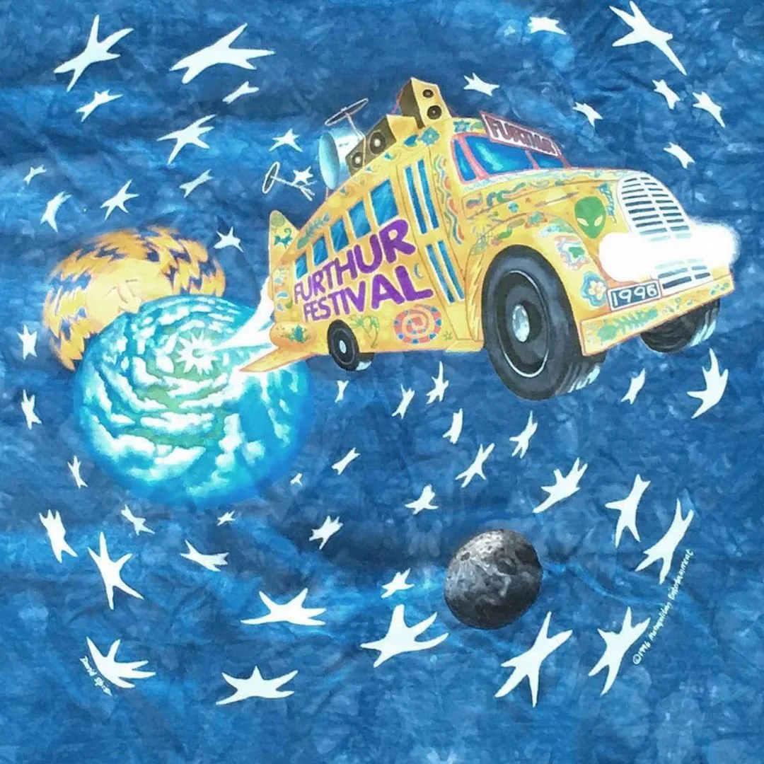
After the Taxi shirt, I began to develop the ideas and presented them to Paul. He would give suggestions, of course. I think the Tarot shirt design was Paul’s idea—he was into that stuff. I always enjoyed skulls and nature, which are in the Evolution design. That was my idea, for sure. It’s funny how it fits in with the non-fiction book work I’m doing now. I would always conceal things in the linework—skulls in the clouds, that sort of thing. The Summer Tour Bus has lyrics hidden in the fence, for instance. I like that many of the designs have endured. Liquid Blue still offers some of the t-shirts, 30-plus years later. I’ve seen that there’s a big secondary market for those vintage shirts. And they pop up in interesting places, like Seth Rogen sporting the Roller Coaster shirt in Platonic, Miles Teller wearing the Spring Tour Bus while standing next to Taylor Swift during the 2024 Super Bowl, and Billy Strings wearing Evolution in Rolling Stone. And I would see a few at shows like Dead & Co. or Phil Lesh and Friends. Designing those shirts was a great gig to get straight out of art school.